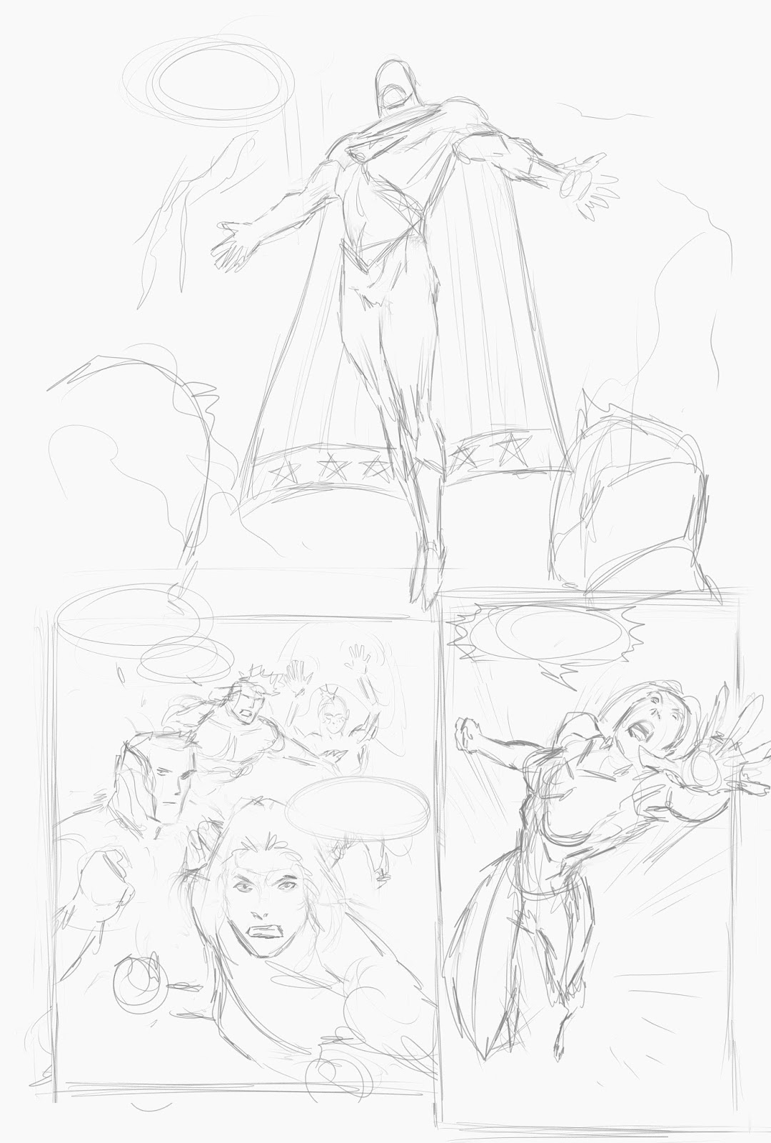
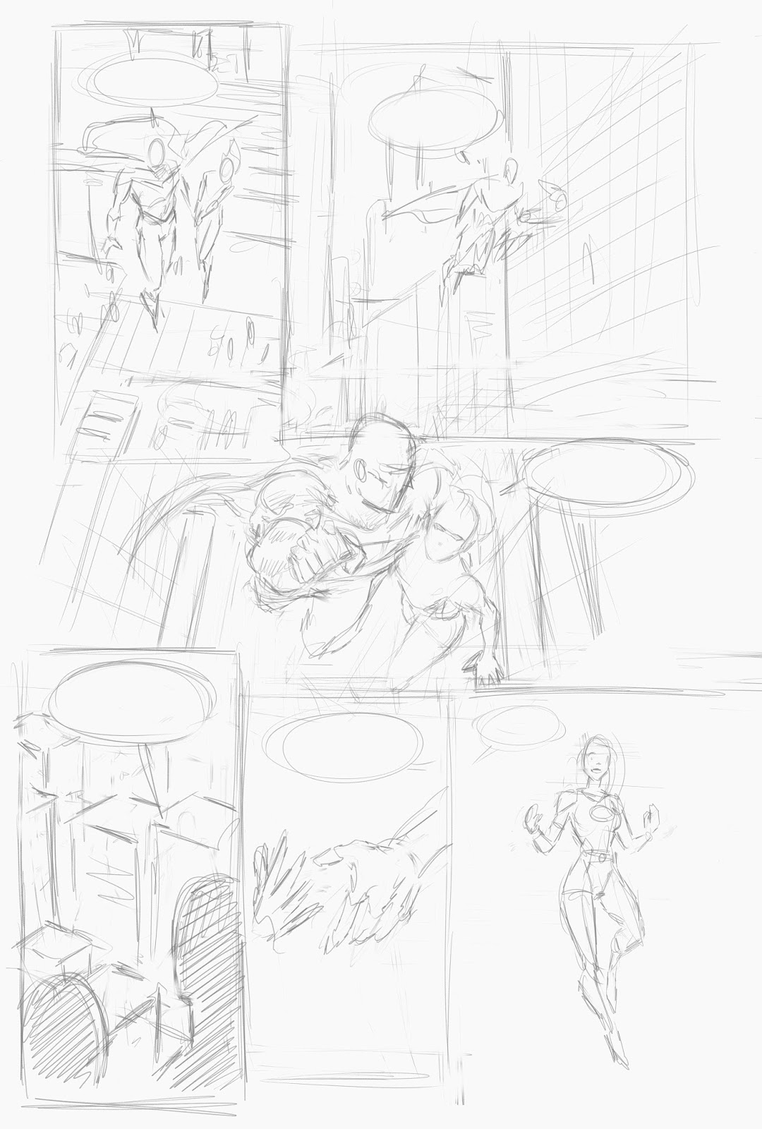
I changed these pages a lot from the initial layouts. I felt that page 9 was too cramped for a few reasons. The figures were all too small, nothing was really becoming the interesting element of the page and there was quite a lot of dialogue. I was also conscious that I need to include more establishing shots. I think its a pretty big flaw in my most recent pages over the last year or so and am trying to consciously do things differently. So I decided to move the bottom panel to page 10 and lose panel 2 from the page 10 layout. I will need to shuffle some word balloons around but I am happier with the results. Page 9 I feel is still incredibly weak. I will definitely make further changes to this page before it is finished. Page 10 has turned out brilliantly though. It's probably one of the best so far.
Showing posts with label layouts. Show all posts
Friday, 16 June 2017
Wednesday, 31 May 2017
Page 3 Inks Page 4 Wip
Pretty happy with page 3 although I will no doubt make some edits in coming days. I do think there is some perspective issues in panel 2. I should be able to correct it by moving elements around. Page 4 has similar problems. It's not clear they are on a car, Alice is about 8 feet tall in the background. This one will be trickier to solve without destroying the composition. Maybe I can get away with cheating it if it looks great.
I'm on track to get about 3 pages done per week at the moment. Once I get a couple more things out the way I think I can get 4 pages inked per week. The plan for now is to forge ahead and get to the 12 page mark then go back and get some colours on the pages. Ill be able to judge by the time remaining and how long this has taken how much I will be able to complete by the deadline. I would like to get more than 24 done but at least would like to hit the 24 mark.
Wednesday, 17 May 2017
Major Project Layouts
I've spent the last week and a half planning out the entire major project. Predictably we have way overshot the mark with 40 pages.
I asked Dom to write the script from my idea and told him to not worry about the page count, just make sure it makes sense. It could have been worse I suppose but it looks like that was a mistake.
Clearly I will be doing the minimum 24 pages and finishing the rest after hand in which is unfortunate but I didn't want to chop the story up anymore as it was already a bit compressed and I don't want to compromise the artwork quality by trying to get all 40 pages done.
I tried to get all the body language and page compositions working at this point so that I can focus on the finish of the pages from here on out. I've noted before but for me this is the hard part. It's all thinking and not much drawing. I'm thinking about plotting out each page so that it is a nice looking illustration when looked at as a whole, that it moves the story forward clearly and additionally i am trying to do similar scenes and shots in different ways each time as I want to avoid getting stuck in a pattern and want to continually be trying new approaches.
There are a few notes in red I have left myself for various changes so that when i come to those pages I can make the fixes before I begin finishing the pages.
There is a variety of quality to the different pages. Some are definitely clearer than others. I think for a few of the pages I will be able to go straight to inks with some panels and save some time that way.
I am a little concerned that I haven't used enough establishing shots. I'll address this as well as I continue with the work.
It was cool to get some double page spreads in there too - something I haven't done before so that will be an interesting challenge.
Anyway, here are the layouts.
Wednesday, 26 April 2017
Major Project Schedule
Working from the assumption that the deadline will be around week 1-2 of August, I have a little over 3 months to complete the project. The schedule can be amended when the final deadline is revealed.
For the first week in May I want to get the script and character designs finalised. I already have the rough plotted in place and I'll be working with Dom to create the final script and dialogue as there are a number of things I want to include in the project. The final page count should be somewhere in the region of 24-30 pages to allow me to spend enough time on each page to achieve the best possible quality. I'll continue working on the characters looks and the costume designs in this time as well.
I will spend the rest of May thumb-nailing and creating page layouts for the project. During this stage I'll spend a lot of time experimenting with different layouts of pages as well as I want to continue to try different ways of using the comic form as I did with Lost Legionnaire. I'll be creating the layouts pencils and inks in Clip-studio but will also take each layout into Illustrator and begin the lettering process as well since it will save some time later on in the project when I will want to be focused on adding finishing touches to the art.
From the last week in May through June and July I will be creating the final artwork. As I complete each page I will export it into Illustrator to add the lettering layers and then into the final InDesign project I have set up already in preparation for printing.
This will leave a week or 2 to make any corrections or as a buffer should I struggle hitting the deadlines.
Friday, 21 April 2017
Major Project Proposal
I mentioned in a previous post that for the major project I am going to create a piece that will fill some gaps in my portfolio and will be relevant work to show publishers at conventions, with whom I would like to work. My main interests are horror, science fiction and superheroes when it come to genres. As I already have The Lost Legionnaire under my belt and have done freelance Science Fiction comics in the past I want this project to be about Superheroes.
As such my main goals are:
- To create and draw a contemporary Superhero story drawing on what I have learned from The Superhero Module specifically and in general the other research modules on the course. This will include all the elements I consider necessary to Superhero stories such as Coogan's definition of Mission, Powers, and Identity, Reynolds ideas of extra effort and Science as Magic and the contrast between ordinary and extraordinary, a political element and an overarching theme being explored in the story.
- To include modern city environments, modern people, vehicles and technology as these things are currently lacking in my portfolio. I need to be able to show I can do these thing's effectively as well as just figure drawing or creatures. I think achieving this would result in my portfolio being quite complete.
- To have a female protagonist. Partly because I am much more comfortable drawing males and it's something I need more practice drawing but also partly because in the past whenever I have written characters they have always been men and I would like to challenge myself to do something different.
- To continue to experiment with page layouts and different ways of effectively communicating the story, again drawing on areas covered in the critical approaches module. I feel that previously I have focused a lot on simple effective visual narrative without really trying to do anything interesting. The storytelling is always number one but at the same time there are also multiple ways to do any one given panel or page. I liked a quote from Alan Moore talking about writing where he said he tried to never do the same thing the same way twice and was always looking for a new way to communicate the idea. During the production of The Lost Legionnaire this was helpful in forcing me to experiment with more illustrative pages - something I had always avoided maybe due to lack of confidence. I am really pleased with the results I got from The Lost Legionnaire and want to continue exploring that aspect of my art with this major project.
The idea I have settled on will include time travel and nanotechnology induced superpowers vie DNA re sequencing with the narrative revolving around a team of enhanced people chasing a criminal through time from decades in the future to present day.
Years ago I read an article about a time traveler who came to our time from an idealic future and while here for one month posted on message forums talking about the future and events to come. This idea, even though clearly an elaborate hoax really captured my imagination and I had always wanted to do some sort of comic around these ideas.
I thought that combining this setting and idea with a Superhero story would be interesting to do as a Major Project.
I will be working on the script in the coming weeks. What I know now is that the story will be about Grief/Loss and will feature a team of 4 Superheros, much like the Fantastic Four really, doing battle against a Superman figure that has gone insane. The majority of the story will take place in present day or the very near future (+2-3 years max). I think the main protagonist will be a girl on the superhero team although I don't want to sideline any of the other characters on the team either. This way I think I can achieve all the goals listed above.
What I am unsure of at the moment is the length of the story. I would very much prefer to have it be a full story complete without the need for further work but the concern is how to achieve that in a number of pages that can be completed to the standard I am aiming for in 3 months considering I will be doing the whole production on my own.
I have had some thoughts on how I will colour the piece in a simpler way to save time but hopefully still look good.
For the penciling and inking style I was going to try and go for something contemporary in superhero comics but after chatting with Heather Antos and thinking more about what way I enjoy working I think I will go for what I did with The Lost Legionnaire but add more fine detail. What I did on the Lost Legionnaire had a very chunky feel to it in terms of the line work. I think I can get a similar appeal on this project but also make it looke more fitting as superhero artwork.
Labels:
Clip Studio paint,
colours,
comics,
illustrator,
InDesign,
inks,
layouts,
pencils,
process,
protagonist,
script,
Unity
Tuesday, 14 March 2017
Comichaus Poster Project
A couple of weeks ago we were given a 2 week project to create a poster for a new comics app for the publisher, Comichaus.
They wanted a 1950's style advert so after some quick research I decided to go for a pretty girl to sell the product. The brief asked for the app to be displayed on an i-pad so that the publisher can stick the different covers into it easily.
That either meant the floating screen that I went with or the back of a character holding the device and looking over their shoulder or the character holding up the device. I decided to keep it simple and have the floating I-pad large and visible in front of the illustration.
I started by finding some reference and doing a rough layout and followed that up with tighter pencils.
I noticed at near the end that the girls body was bothering me. I think it needs to be a bit longer around the mid section. If the publisher comes back and wants to use the image I will edit it to fix this as it will annoy me for it to be out there when I know it's "wrong".
They wanted a 1950's style advert so after some quick research I decided to go for a pretty girl to sell the product. The brief asked for the app to be displayed on an i-pad so that the publisher can stick the different covers into it easily.
That either meant the floating screen that I went with or the back of a character holding the device and looking over their shoulder or the character holding up the device. I decided to keep it simple and have the floating I-pad large and visible in front of the illustration.
I started by finding some reference and doing a rough layout and followed that up with tighter pencils.
I then inked the image in vector layers. I find this helps me clean up the line manually after drawing by using the vector tools in Clip Studio as I have quite a shaky hand generally.
I noticed at near the end that the girls body was bothering me. I think it needs to be a bit longer around the mid section. If the publisher comes back and wants to use the image I will edit it to fix this as it will annoy me for it to be out there when I know it's "wrong".
After the line work was done I flat coloured the image and began rendering with light and shadow layers and finally finished off the piece by dropping in some old paper textures and stains at low opacity. I actually think the flat colour version might work better. It's really nice and graphic.
The red background is clashing with the .com of the logo. Even changing the .com to white I think the background colour will still have to be edited.
Subscribe to:
Posts (Atom)