
Showing posts with label colours. Show all posts
Showing posts with label colours. Show all posts
Saturday, 5 August 2017
Cover
Here is the finished cover for the comic. I think the logo could be better but it kind of works. I was trying to capture the feel of the old X-Men logo. I also think that the cover could be stronger. I was already too committed to the lines to completely change it when I decided I wasn't 100% happy with it. I should have had a few more options in the rough stage before I moved ahead. I don't like that the heroes are kind of small in the back and I wonder if it's clear enough who the heroes and villains are. If i had to redo the cover I would make that more obvious and have the team take a more central role in the image.


Wednesday, 26 July 2017
Pages 1-24
Here are the original 24 pages completed bar some colour corrections and fixing any errors I find. I'll be adding 2 more pages, a cover, and title credits, etc... over the next few days. If all goes well I might actually finish a few days before hand in.
My take on the pages at the moment is that I might have over done the texture image. I think it's a little low res as well. If I can find a higher res one I want to use I can edit the colours to keep them with the aged faded look. There're also some slight colour variations on the white on each page as I have used some colour layers on Hard light on most pages but using a different colour. It might not be worth "fixing" that as it is barely noticeable.
Over all I am really pleased with how these pages have turned out, particularly because I am not experienced colouring at all.


Saturday, 22 July 2017
14-15
Two more pages done today. As with the penciling and inking, it feels as though the way I started on early pages with the colouring is not the way I am working now. I am trying consciously to keep the pages looking consistent.


Friday, 21 July 2017
1-13
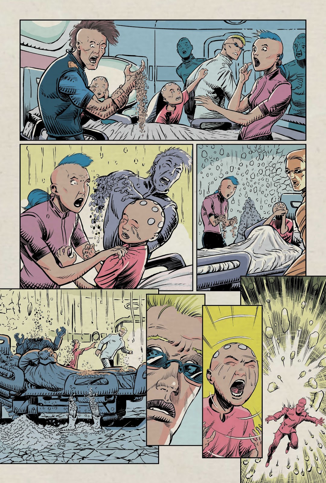
I've coloured half the comic now. I think I screwed up by using different colour pallettes for different scenes. I think what to do is have one colour pallette for the whole issue as otherwise it looks like it doesn't belong together.
I "fixed" it by making post colouring adjustments to make all the pages match. I think it looks better than it did but perhaps needs some further tweaks. At the stage the pages are at I will be able to do this once artwork is complete. That makes the most sense to me as I will be able to look at the book as a whole while making corrections.


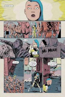


I "fixed" it by making post colouring adjustments to make all the pages match. I think it looks better than it did but perhaps needs some further tweaks. At the stage the pages are at I will be able to do this once artwork is complete. That makes the most sense to me as I will be able to look at the book as a whole while making corrections.



Thursday, 20 July 2017
Texture
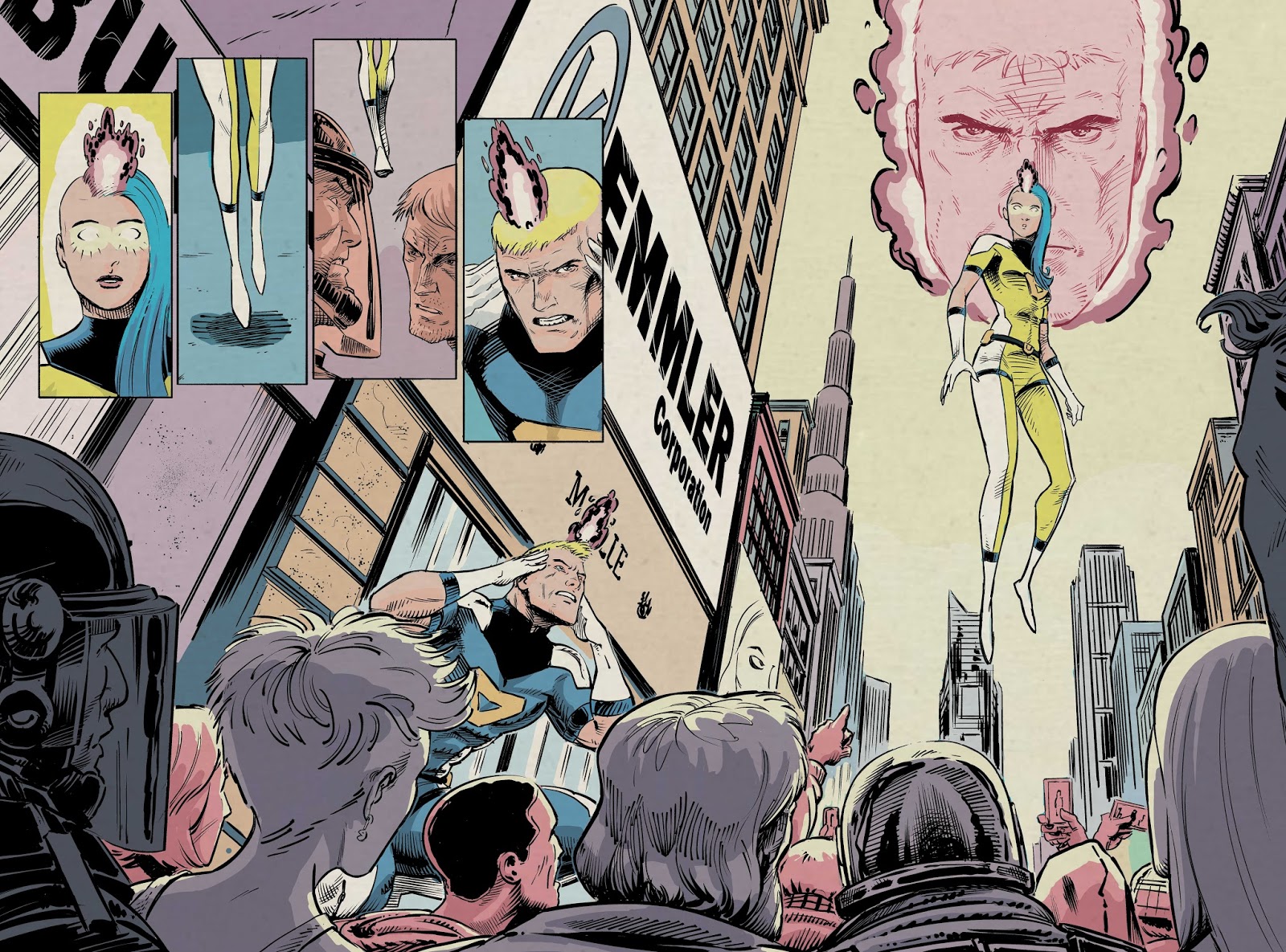
I've been playing around with a paper texture to "age" the pages a little. I think it's a nice fit with the overall retro style of the lines and colours although at this level it might be overdone. Here they are along with 2 new pages. I also edited 5-6 to remove the cyan as I felt it was clashing with the previous page and they are both depicting the same scene.




Wednesday, 19 July 2017
Page 1-6 Colours
Here are the first 6 pages coloured. I've done some corrections and adjustment layers to make them work a bit better together. I've also dialed back the saturation as it was a bit out of control.
Something is really bugging me about the double page spread and I can't put my finger on it. Hopefully some fresh eyes on it tomorrow will help me work it out.


Subscribe to:
Posts (Atom)