Here is the finished cover for the comic. I think the logo could be better but it kind of works. I was trying to capture the feel of the old X-Men logo. I also think that the cover could be stronger. I was already too committed to the lines to completely change it when I decided I wasn't 100% happy with it. I should have had a few more options in the rough stage before I moved ahead. I don't like that the heroes are kind of small in the back and I wonder if it's clear enough who the heroes and villains are. If i had to redo the cover I would make that more obvious and have the team take a more central role in the image.
The Lost Legionnaire
Saturday, 5 August 2017
Monday, 31 July 2017
1-26
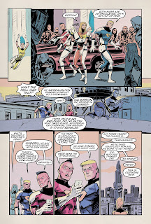
Here are one of the final passes at the pages. I have updated the blurry texture to a higher resolution one. I might still take another pass at the pages and do some colour corrections and line-work tidying up.
The final two pages that had to be added were a pain frankly. I think that there is too much shown for only 2 pages resulting in me squeezing stuff in. It could have been an extra 4 pages had I had time and energy. There are a couple of panels I am not keen on and I am not sure the storytelling is clear enough in the sequence either.Ultimately, they sort of do the job but I'm not sure they are to the same standard as the previous pages and can tell I am not happy with them at all.
I will look at them with fresh eyes tomorrow and see if they can be improved but after that I will draw a line under it and move on. I still have the cover to sort, last fixes and some logo design work to complete for it.
Wednesday, 26 July 2017
Pages 1-24
Here are the original 24 pages completed bar some colour corrections and fixing any errors I find. I'll be adding 2 more pages, a cover, and title credits, etc... over the next few days. If all goes well I might actually finish a few days before hand in.
My take on the pages at the moment is that I might have over done the texture image. I think it's a little low res as well. If I can find a higher res one I want to use I can edit the colours to keep them with the aged faded look. There're also some slight colour variations on the white on each page as I have used some colour layers on Hard light on most pages but using a different colour. It might not be worth "fixing" that as it is barely noticeable.
Over all I am really pleased with how these pages have turned out, particularly because I am not experienced colouring at all.
Subscribe to:
Comments (Atom)


